

COMPANY
Realtor.com
GOAL
Offer a tool to help buyers understand their buying power by pricing home features. “What can I get for my money, so I can determine my target home criteria that matches my budget.”
ROLE
As the UX Design Principal, I explored a range of concepts, wireframes, and visual directions. I worked closely with a Product Manager, User Researcher, and Developer to facilitate a kick-off session, conceptualization exercises, user research, and design reviews with stakeholders.

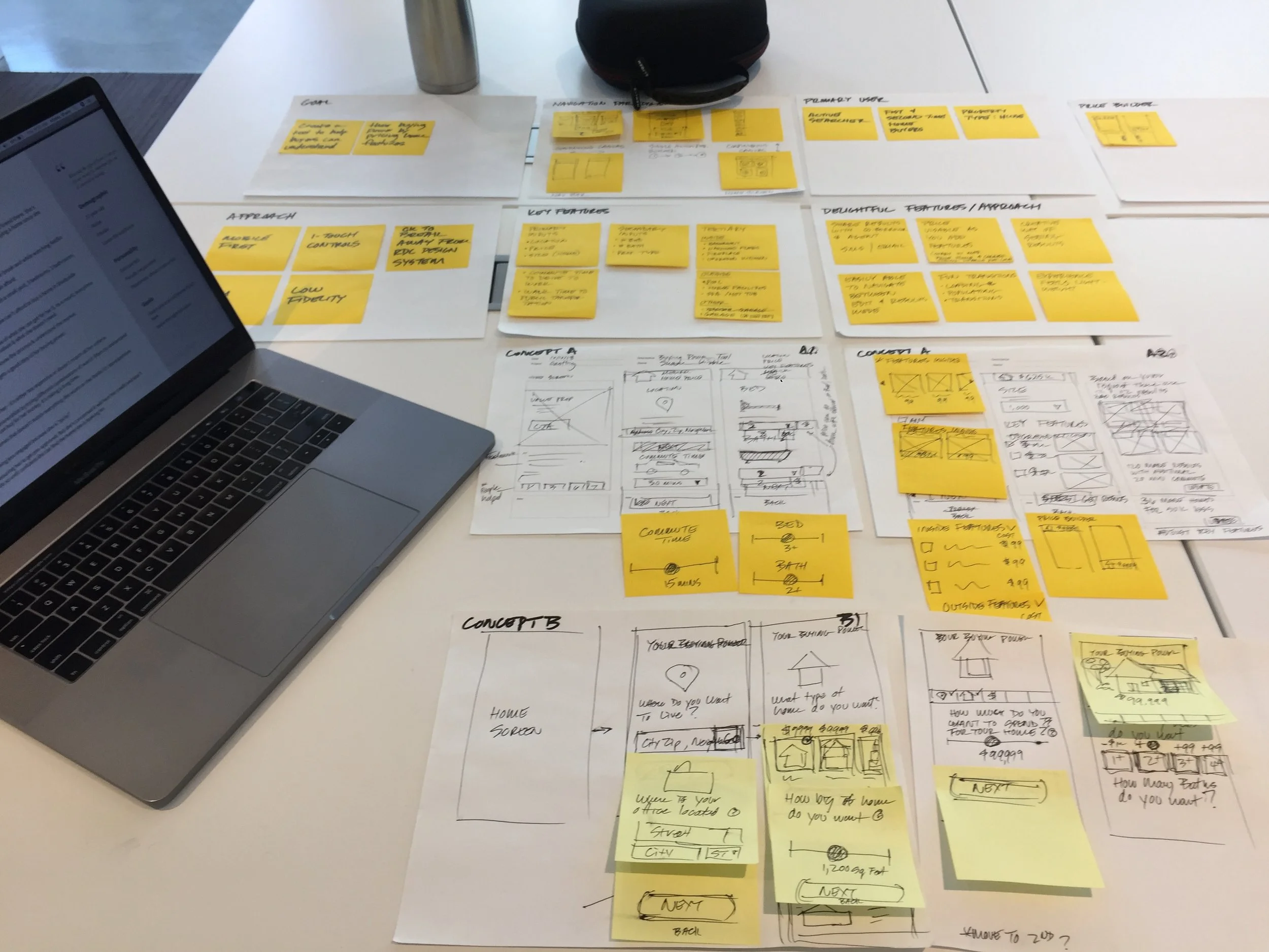
Hosted a series of brainstorming sessions with cross-functional disciplines.
AFFINITY DIAGRAM
Wrote ideas on stickies and placed them into groups. This helped narrow down the product direction to “Want’s vs Must Haves”.

FINAL DIRECTION
Shorten the home buying process by helping home buyers understand the tradeoffs between what they want vs what they must have.
TARGET AUDIENCE
Active home searchers
ASSUMPTIONS
- Pricing home features will help home buyers understand their pricing power, so they will be more willing to take the next step and get pre-approved
- Home buyers are set on where they want to live based on work commute, and are unwilling to budge on location
- Key criteria include: Location, Price, and Features
- People have a bit of wiggle room within their max price range
STRATEGY
- Mobile first
- Modular
- Rapid prototype and test
- Fast to launch
- Slim MVP
REQUIREMENTS
- Cost per criteria, such as: pools, hardwood floors, upgraded kitchen, backyard, etc.
- Listings that match criteria
- Breakdown of monthly mortgage payment
- Save criteria

I identified how this product would enhance the first time home buyer’s journey while relieving extreme pain points.
As the Principal UX Designer for Mortgage, I contributed to all finance related touch points of Realtor.com’s journey map.

CONCEPT
Home buyers can select the features they want in a home and see how this impacts the price and inventory.
DELIVERABLES
Created wireframes and click-trough prototypes to validate concepts with home buyers.

CONCEPT
Home buyers can see a wide range of home options and then refine their criteria based on their financial situation.
DELIVERABLES
Created wireframes and click-trough prototypes to validate concepts with home buyers.

CONCEPT
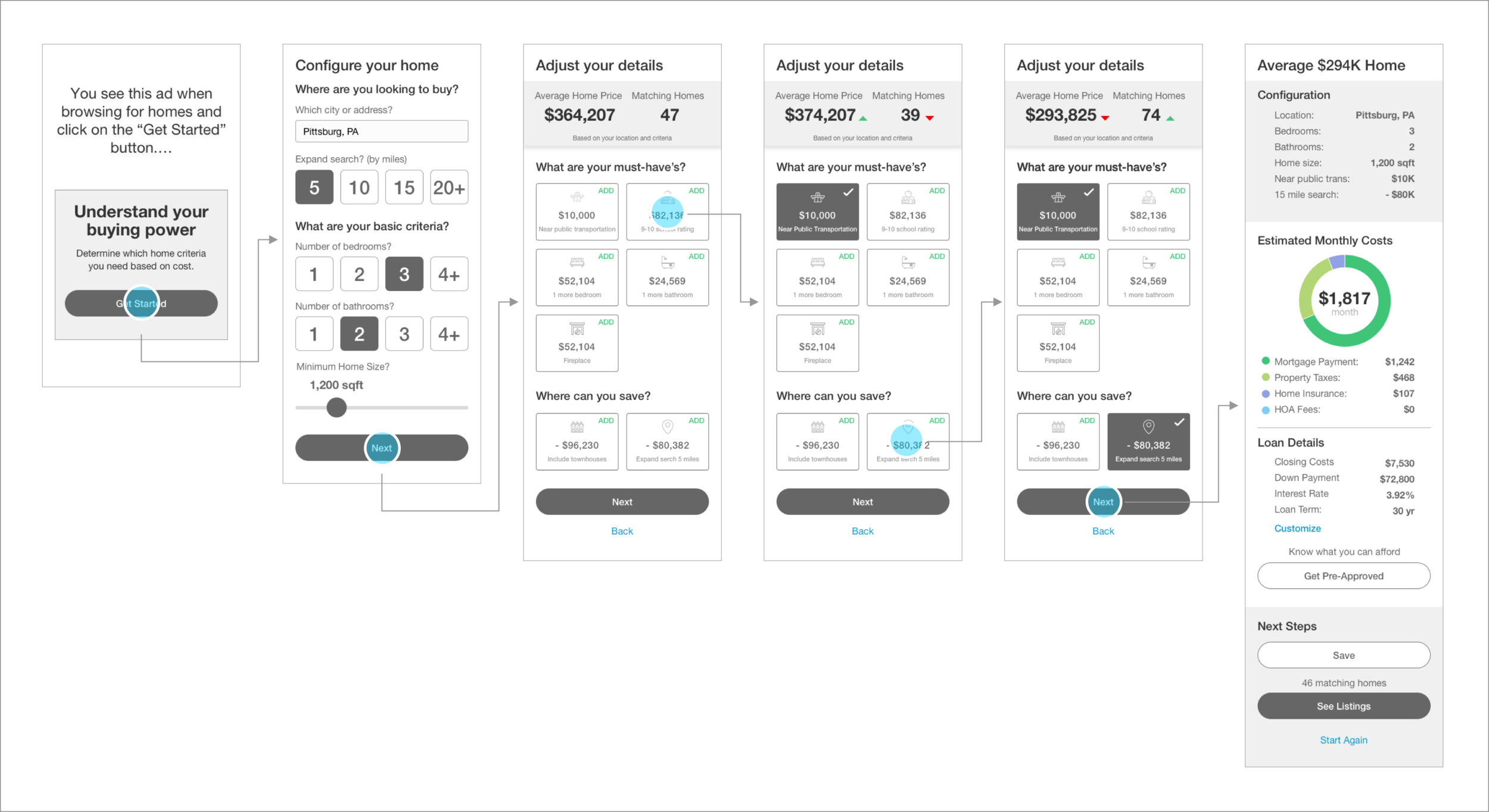
Home buyers can see how their criteria effects the maximum home price. They receive tips to help evaluate tradeoffs between what they want and what they must have when the cost of features exceed their maximum home price.

ENHANCEMENTS BASED ON USER RESEARCH FINDINGS
- Added more features for home buyers to select
- Provided clearer relationship between what is selected and how it effects price of home
- Separated “What are your must have’s?” and “Where can you save?” sections
- section from Removed inventory bar graph, it was not adding much value
- Replaced multiple tap menus with one tap controls
- Added visual donut graph to communicate “Estimated Monthly Costs”
- Added “Save” button
- Added “Start Again” link

Incorporated research findings into final round of designs.
Tested on-brand and off-brand visual designs with home buyers. The off-brand visual designs tested better with home shoppers.
The on-brand designs leveraged our existing design system.

The off-brand visual designs included a new visual language, interaction patterns, and affordances.

COMPANY
Move.com
GOAL
Create the industry’s first truly end-to-end self serve mortgage platform what you can a) see what you can afford, b) pre-qualify for a loan, c) apply for a loan, and d) refinance your existing loan... all on-line.
ROLE
As the design lead, I ensured every field on the 1003 off-line mortgage application was accounted for within the on-line experience. I lead brainstorming and user research sessions, established the visual language, interaction patterns, and partnered with content specialists, visual designers, and front end developers to launch the product with high quality and on time.

It was clear as we set out to design the first online mortgage application that there are many hurdles customers have to overcome. Their goal is not to own a mortgage, but to own a home. This was very important to keep this in mind – to be empathetic to their pain points and keep the goal of owning a home in mind throughout the entire lending process.

I worked closely with the VP of Mortgage to provided an overview of Mortgage Match's benefits, and how our product was superior to the competition. This document was presented to the entire organization and our venture partners.

Working side by side with the Product Manager and the Engineering team, we combed through the 1003 Mortgage Application to ensure every requirement was caputred and fields were properly mapped to the back end decision engine.

Created a mind map to explore a wide range of ideas for the home page priorities.

I worked closely with the Product Manager, and Engineering to ensure the flows were accurate for each touch point and path: home page, mortgage calculator, prequalification, purchase, refinance, and loan center.

Design reviews were conducted regularly with the Product Manager, UX Manager, and Engineering.
I lead the meetings by posting the designs and outlining the goals, KPI metrics, and other specific requirements. We would review the solutions while I captured key take-a-ways. The results were then emailed out to the team and posted online to ensure everything was captured correctly and we were all on the same page. Having a history of decision that were made proved to be indispensable.

Mutiple types of user research were conducted throughout the entire project:
• Conceptual testing - early concepts and wireframes
• Usability studies - prototypes and working demos
• Multivariate testing – post launch

As part of a cohesive visual language, I created a visual style guide which covered:
• Logos
• Page Archetypes
• Headers & Footers
• Font
• Color Palette
• Buttons
• Photo Usage

The home page contained the following sections to position Mortgage Match as an industry leading full service mortgage platform for existing and potential customers:
• Clear value proposition and prominent call to action to begin the prequalification process. This is important being that whoever provides the customer with a prequal letter is most likely going to get their business for a home loan... and even a refinance loan in the future.
• Mortgage calculator module with real rates and products to help customers learn what they can afford (only 6 questions via progressive disclosure).
• Clear Sign In button and Register link
• Support modules to learn about Mortgage Match and build trust
• Educational articles and news to help customers learn at their pace as well as become a trusted advisor
• Additional tabs for "Refinance" and "My Loan Status"

Upon answering 6 questions, the customer was quickly rewarded with a loan amount they could actually afford. Results were based on actual rates. The interactive widget provided an in-depth summary with a high level of transparency.

A high level of contextual support (both field and page level) was carefully considered throughout the application. We strove to create an experience which portrayed a trusted advisor. This helped reduce the number of customers abandoning the application in favor of a high-touch off-line experience.

The newsroom provided education at every stage of the mortgage journey. Articles provided great SEO value and enabled deep linking to the site through organic search.

I worked very closely with an external agency to create several marketing campaigns to promote Mortgage Match.
Emphasis was placed on ensuring the marketing landing pages aligned with the Visual Style Guide.

Mobile App Integration
Worked with Product Manager and Mobile Designer to integrate Mortgage Match’s “know how much you can afford” feature into Realtor.com’s home search iPhone app.
This provided brand awareness for Mortgage Match, while adding significant value to the home search experience of knowing if you can afford each listing going forward.